FRED Graph: US 🇺🇸 Sectoral Balances
Tracking the sectoral balances of a nation’s economy is a great way to build a narrative about its economic dynamics. It’s true, that an accounting identity doesn’t say much about causation. But they hint it and if we have a behavioural model around it, then we learn a lot more. It was used by Wynne Godley to highlight the predicament on the horizon in the 2000s.
The Federal Reserve Bank of St. Louis has a nice website FRED where you can create charts and even observe them when new data gets updated. Below is the U.S. sectoral balances chart. This is a static image file. For the dynamic chart, track the link above (the header of this page).
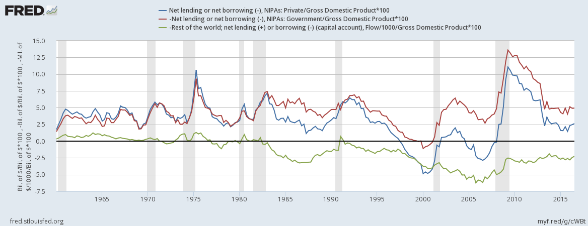
The blue line is the private sector net lending—its income less expenditure— which was in deficit and led to the crisis. The red line is the government’s deficit and the green line is the current account balance of international payments.