The Federal Reserve released the Flow of Funds Accounts of the United States today.
The Flow of Funds Accounts provides one of the best snapshot of an economy. In an article appropriately titled ‘No one saw this coming’ – or did they? (see the full paper here), Dirk Bezemer correctly recognizes that the Economics profession’s ignorance of Flow of Funds had a big role to play in its inability to see a crisis coming. Bezemer says
We economists – and the policymakers who rely on us – ignore balance sheets and the flow of funds at our peril.
Of course, as Bezemer points out, there were exceptions. Post Keynesians were always aware of the flow of funds because monetary economy is a natural starting point in their theory. Wynne Godley and Marc Lavoie wrote a book (my favourite!) Monetary Economics: An Integrated Approach To Credit, Money, Income, Production and Wealth, Palgrave Macmillan, 2007, to unify Post Keynesian theory and the flow of funds approach, perhaps improving the presentation of the latter using something called the “transactions flow matrix”.
In my opinion, nobody even came close to Wynne Godley in not only predicting the crisis but the warning about the difficulties in resolving it.
One notable highlight of today’s Z.1 release was that
Household net worth—the difference between the value of assets and liabilities—was $57.4 trillion at the end of the third quarter, about $2.4 trillion less than at the end of the previous quarter.
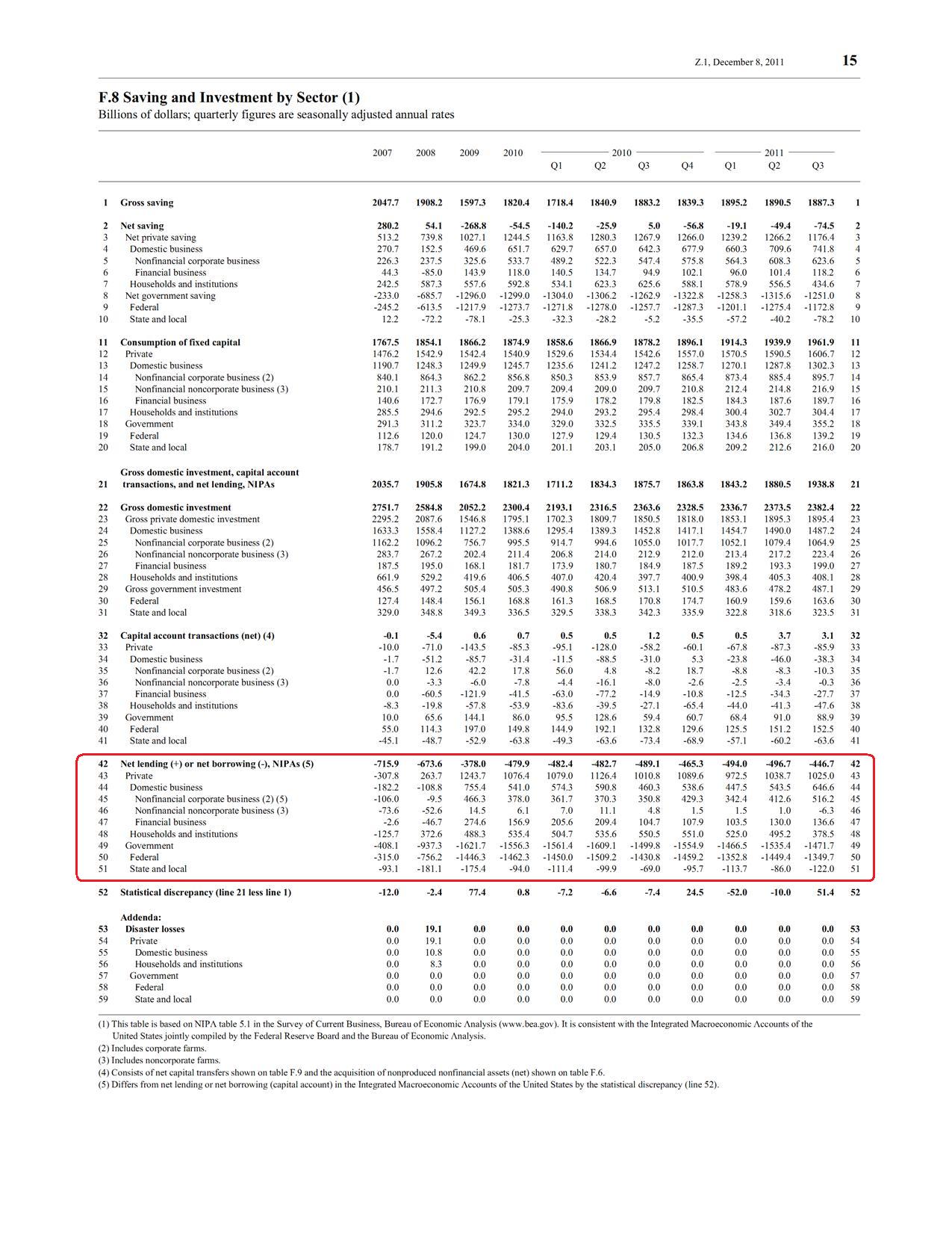
A lot of readers will know about sectoral balances. How do we get that from Z.1? Table F.8 gives “Net Lending” of each sector of the economy. The difference in a sector’s income and expenditure is it’s “Net Lending”.
 (click to expand, and click again to expand)
Before the crisis, the private sector had its income lower than expenditure and was financing the difference by borrowing from the other sectors. As the crisis hit, private sector expenditure retrenched – so you can see how the private sector has become a net lender from being a net borrower before the crisis. Because of this, the government’s borrowing increased from (line 49) $408.1bn in 2007 to $1,471.7bn in Q3 2011 (annualized). It was also due to a relaxation of fiscal policy during the crisis, in order to stimulate demand. The expenditure of the United States as a whole is higher than its income, and the difference is the current account deficit. This is financed by net borrowing from foreigners (line 42) – which was $446.7bn in Q3 2011 (annualized). This deficit was $715.9bn in 2007, bleeding demand at a massive scale from the US economy.
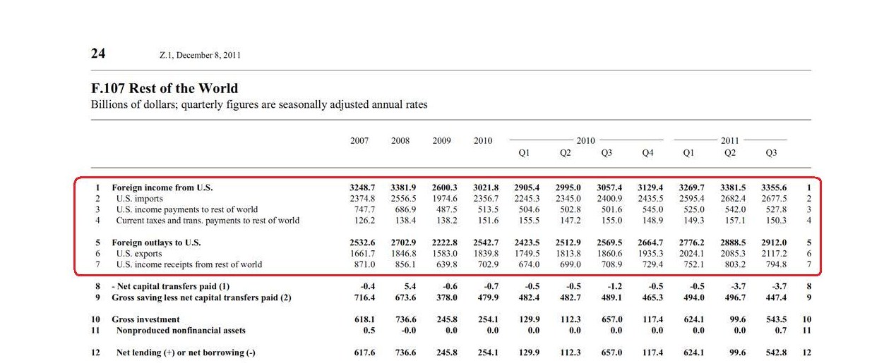
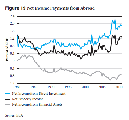
There are two more tables I see closely. The first is the net income payments from the rest of the world, which surprisingly remains positive, leading to a lot of literature about “dark matter”. (More on that some other time). This, according to the Z.1 is the “net receipts from foreigners of interest, corporate profits, and employee compensation”.
The Levy Institute has been tracking this since 1994. Here’s a latest graph (from their March 2011 analysis)
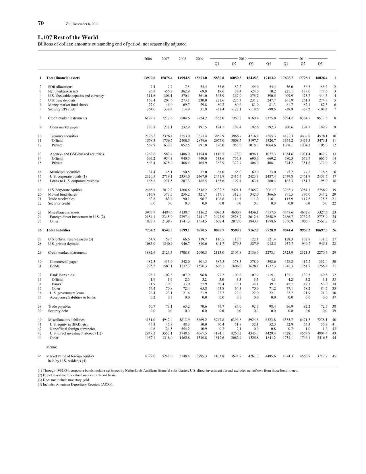
There are discrepancies between BEA and Fed data. The other table which I rush to check, whenever the flow of funds data is released is the United States’ net indebtedness to the rest of the world – L.107:
 which at the end of Q3 was $3,616bn, or 24% of GDP.
There’s a new table – L.108, Financial Business – which actually appeared first time in the previous release (Q2). This sector had $64,299bn in assets and $60,457bn of liabilities at the end of Q3!
Of course, I look at all the tables at some time or the other. Highly recommended.

