The Bank of England released the semiannual Financial Stability Report, December 2011 today. Complete book here. These reports have a lot of information, in addition to being well-written, well-formatted and colourful.
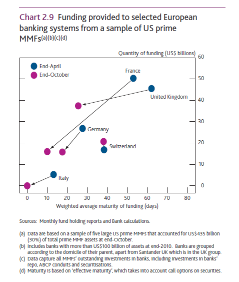
The following graph shows how international banks’ funding from US Money Market Mutual Funds changed during the year.
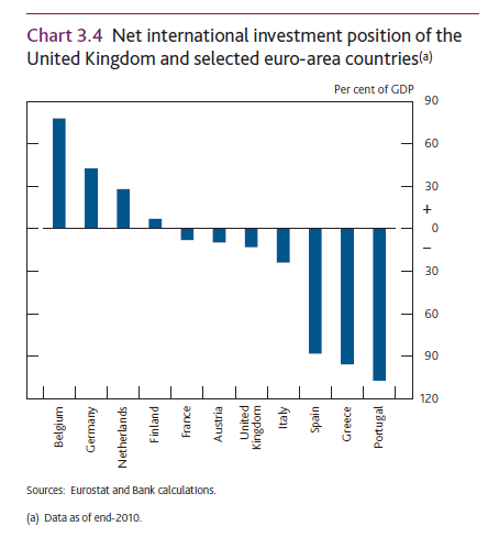
It also plots the Net International Investment Position (the negative of a nation’s debt) – which I have plotted many times in this blog (see here and here for example) and linked to other sources who have plotted it recently and is the reason for my writing this post!

Nice report. Go read.
Update: FT Alphaville’s post BoE charts, UK banks’ gloom also discusses some (different) charts from the report.
Update2: One most post from Alphaville on this.
Update 3: Another one from Alphaville today on Central Counterparties.

