Chart: Eurozone Indebtedness

The Euro Zone is under a crisis. Is there a chart which shows what the underlying factor is which makes the difference ? Below:


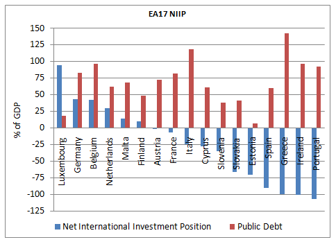
You can see that the external situation is clearly the one which makes the difference as opposed to the public debt. It’s true that Belgium’s bond market is under pressure – creditors may not like high public debt but I think the graph is still useful.

Leave a Reply

Your email address will not be published. Required fields are marked *

You may use these HTML tags and attributes: <a href="" title=""> <abbr title=""> <acronym title=""> <b> <blockquote cite=""> <cite> <code> <del datetime=""> <em> <i> <q cite=""> <s> <strike> <strong>

Note: If not opted-in, comments in moderation can be previewed only for a short while.

This site uses Akismet to reduce spam. Learn how your comment data is processed.